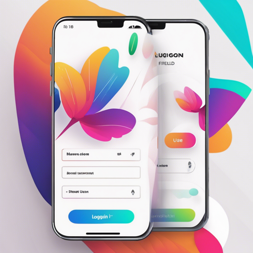
Welcome to the world of Flutter! If you are looking to enhance your applications with beautiful UIs, you’re in the right place. This guide will walk you through using a collection of Login Screens, Buttons, Loaders, and Widgets that are ready to be integrated into your projects.
Showcasing the SlideListView Widget
Let’s kick things off with the SlideListView widget. This widget is designed to present two different views, allowing users to toggle between them with a sleek cube-rotation animation, enhanced by a Floating Action Button.
SlideListView(
  // Widget properties here
)
Think of it as flipping between two pages of a book—one moment you see one side, and the next, you get to see the other side with a dynamic transition. This makes user interaction engaging and seamless.
Dynamic Loaders to Liven Up Your App
Loading indicators are crucial for enriching user experience. Here are a few Color Loaders and Flip Loaders you can use in your apps:
- ColorLoader: Instantly recognizable loaders in varying colors.
- FlipLoader: A modern spin with a flipping animation that captures user attention.
For example, here’s how you can set up a FlipLoader:
FlipLoader(
  loaderBackground: Colors.red,
  iconColor: Colors.white,
  icon: Icons.email,
  animationType: full_flip,
)
Imagine these loaders as stages where the performer (your app) gets ready to deliver its next act (content) while keeping the audience (users) entertained!
Buttons That Stand Out
The collection includes several button styles that are both functional and attractive. Here are some examples:
- Simple Round Button: A basic yet effective button for actions like “LOGIN”.
- Simple Round Icon Button: Perfect for actions such as “SEND EMAIL”.
- Simple Round Icon Only Button: Minimal and efficient for crucial functionality.
Setting up a button might look like this:
SimpleRoundButton(
  backgroundColor: Colors.redAccent,
  buttonText: Text('LOGIN', style: TextStyle(color: Colors.white)),
  textColor: Colors.white
)
You can think of buttons as light switches; they instantly turn something on or off when pressed, facilitating various actions in your app smoothly.
Creating User-Friendly Login Screens
Six unique Login Screens tailored for various styles are available for you:
- Login Screen 1: Simple and elegant.
- Login Screen 2: With gradient backgrounds for a modern look.
- Login Screen 3: Good for minimalist applications.
- Login Screen 4: Feature-rich with customizable colors.
- Login Screen 5: Embeds functionality for Google sign-in.
- Login Screen 6: Focused on seamless navigation.
Implementing any of these login screens can be done easily through the following structure:
Container(
  child: LoginScreen1(
    primaryColor: Color(0xFF4aa0d5),
    backgroundColor: Colors.white,
    backgroundImage: new AssetImage('assets/images/full-bloom.png'),
  ),
)
Each login screen serves as an inviting doorway for users, encouraging them to step inside and explore.
Troubleshooting & Helpful Tips
If you encounter difficulties implementing these widgets or screens, consider the following:
- Ensure all necessary packages are included in your pubspec.yaml file.
- Check for typos in widget properties or method names.
- Make sure to import the dart files correctly where these widgets are defined.
- If animations look choppy, test on a physical device rather than an emulator.
For more insights, updates, or to collaborate on AI development projects, stay connected with fxis.ai.
Conclusion
At fxis.ai, we believe that such advancements are crucial for the future of AI, as they enable more comprehensive and effective solutions. Our team is continually exploring new methodologies to push the envelope in artificial intelligence, ensuring that our clients benefit from the latest technological innovations.
Happy coding with Flutter!

