
Visualizations are not just a collection of data points; they are visual stories that can engage and inform your audience. Multiplex is a powerful Python library designed on this principle, making it easier for you to transform data into beautiful, narrative-driven visualizations. In this guide, we’ll take you through the installation process, a quick start on creating visualizations, and troubleshooting tips to ensure a smooth experience.
Getting Started with Multiplex
To embark on your journey with Multiplex, you first need to set it up properly. Here’s how:
Prerequisites
- Ensure matplotlib is installed, as it serves as the backbone for Multiplex. You can install it with:
python -m pip install -U matplotlibInstalling Multiplex
Once you have your prerequisites in place, installing Multiplex is a breeze. Simply run:
python -m pip install -U multiplex-plotQuick Start: Create Your First Visualization
Creating visualizations with Multiplex is straightforward. In just ten lines of code, you can generate a text-only visualization. Think of it like painting a picture with fewer strokes!
Here’s an analogy to help you understand: imagine you’re telling a story to a friend. Instead of preparing detailed notes, you jot down key points, embellish them with engaging words, and then narrate them to capture your friend’s attention. Multiplex allows you to do something similar with data visualization, focusing on the main points while it takes care of the intricate layout.
Here’s how you can create a visualization:
import matplotlib.pyplot as plt
from multiplex import drawable

plt.style.use(styles.multiplex.style)
viz = drawable.Drawable(plt.figure(figsize=(10, 2)))

paragraph = "Anthony Lopes is a Portuguese professional footballer who plays for Olympique Lyonnais as a goalkeeper."
style = { "align": "justify", "fontfamily": "serif", "alpha": 0.9, "lineheight": 1.25, "lpad": 0.1, "rpad": 0.1 }

viz.draw_text_annotation(paragraph, **style)
viz.set_title("Profile: Anthony Lopes", loc='left')
viz.set_caption("Wikipedia is a useful repository to get more information about anything.")
viz.show()
Example Visualizations
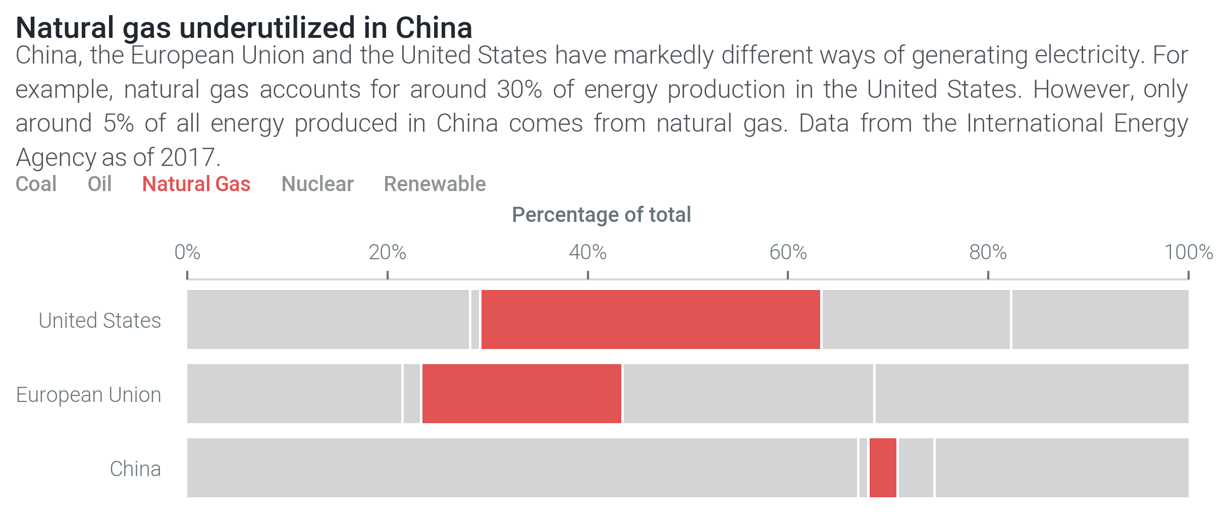
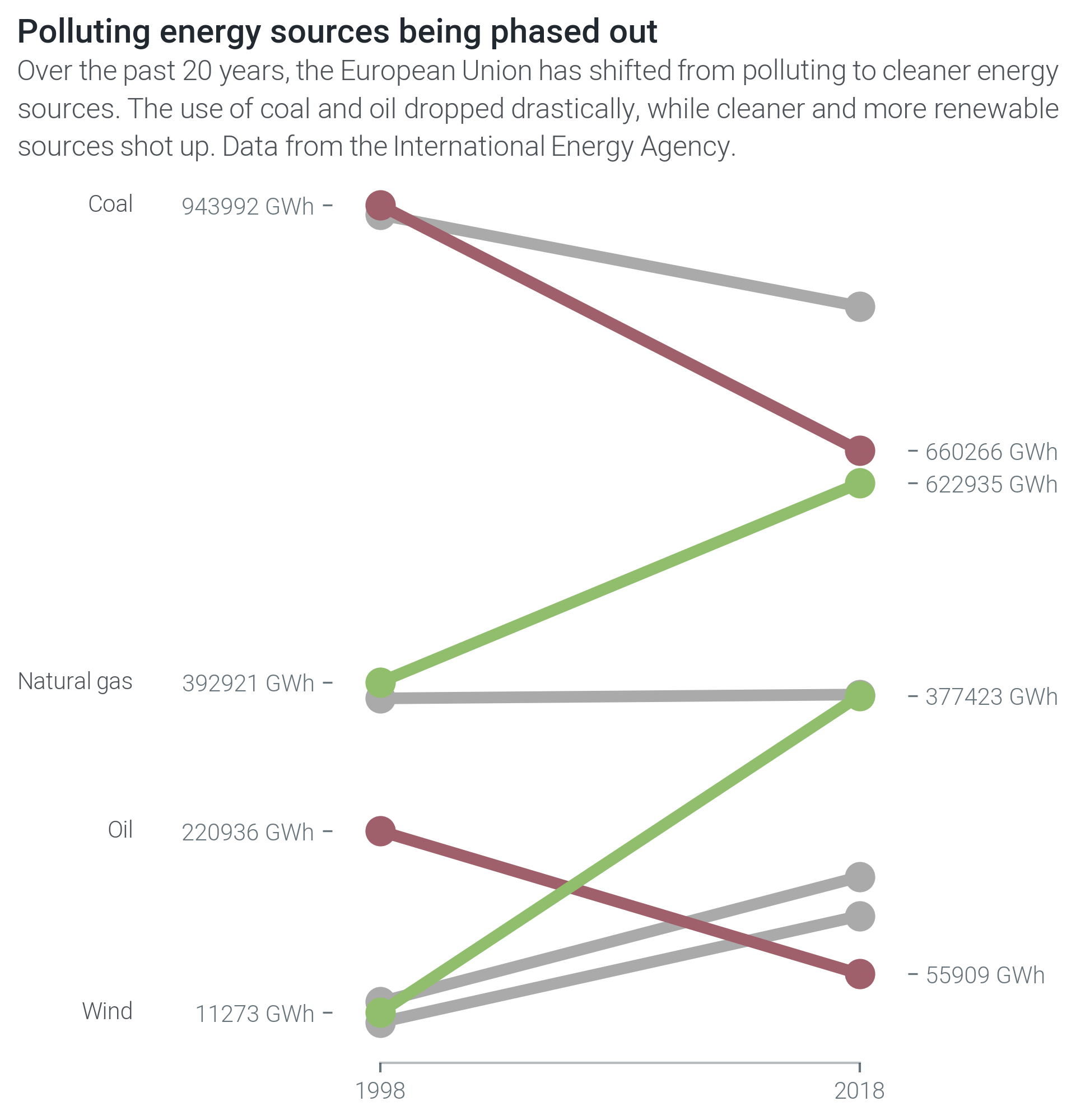
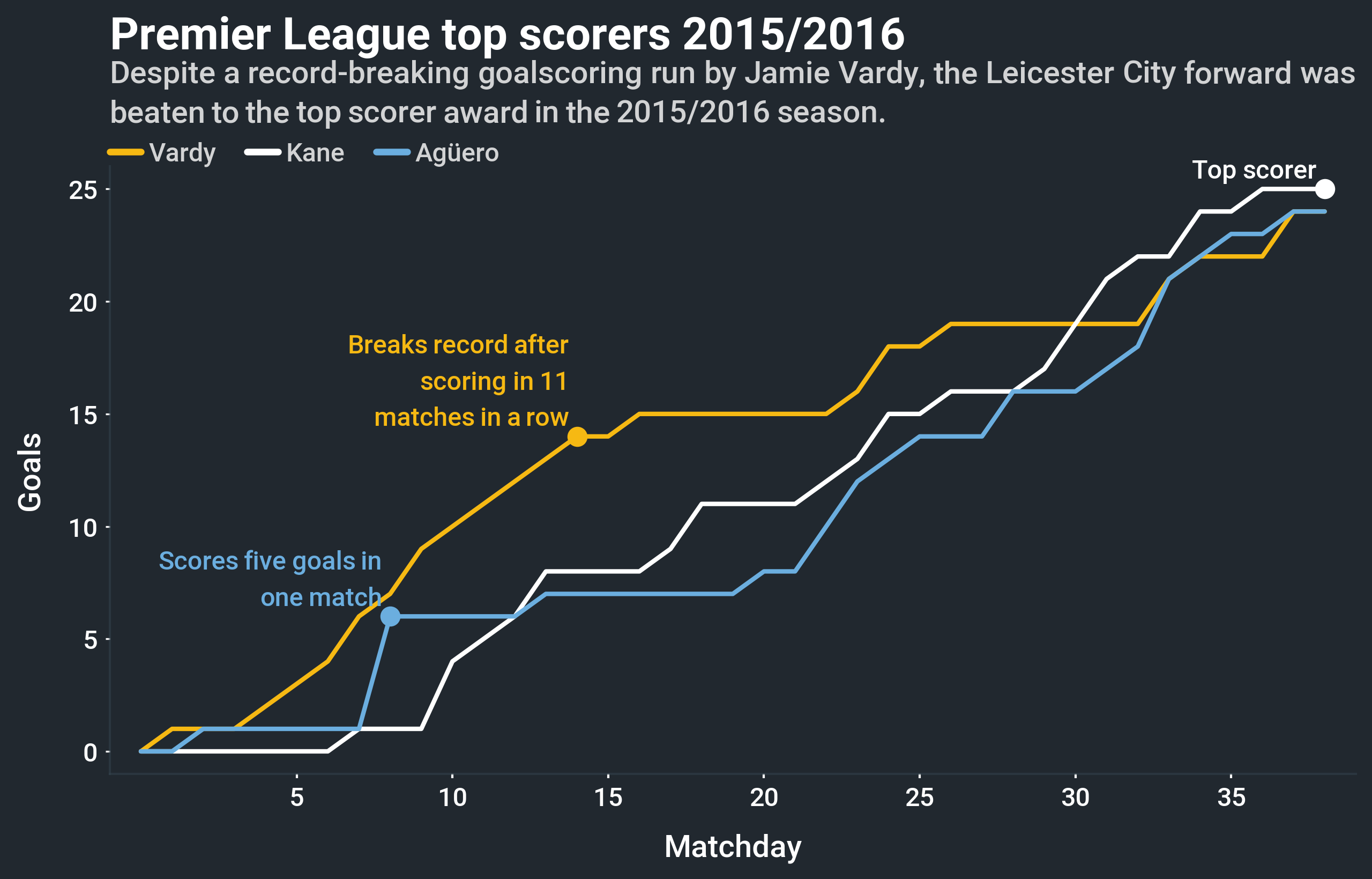
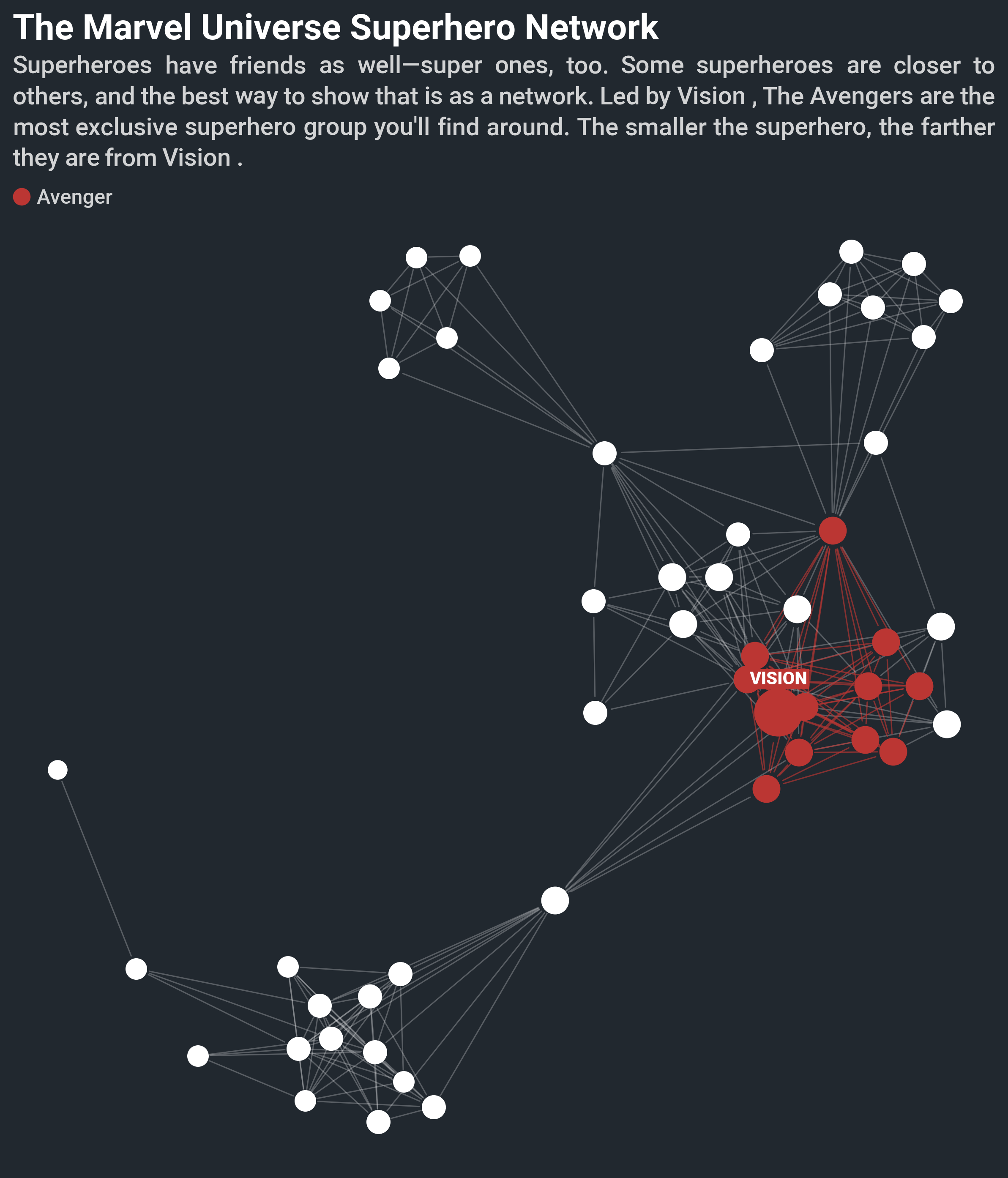
For inspiration, here are some examples of what you can create with Multiplex:
Troubleshooting Tips
If you encounter issues while using Multiplex, try the following troubleshooting ideas:
- Check if all prerequisites are correctly installed. This includes matplotlib and any additional libraries like networkx and pandas.
- Review your code for any syntax errors or typos, especially while importing libraries or styles.
- Visit the Multiplex documentation for further insights and detailed explanations.
- For more insights, updates, or to collaborate on AI development projects, stay connected with [fxis.ai](https://fxis.ai).
At [fxis.ai](https://fxis.ai), we believe that such advancements are crucial for the future of AI, as they enable more comprehensive and effective solutions. Our team is continually exploring new methodologies to push the envelope in artificial intelligence, ensuring that our clients benefit from the latest technological innovations.
Conclusion
Multiplex is a groundbreaking tool that takes data visualization to the next level, allowing you to tell your stories beautifully and effectively. With easy installation, a straightforward approach to visualizations, and powerful capabilities, it opens the door to endless creative possibilities. Happy visualizing!